
Risk Heat Maps: useful or not?
What is Heat Map?
A risk matrix is a matrix that is used during risk assessment to define the level of risk by considering the category of probability or likelihood against the category of consequence severity or impact.
There are many categories to represent the probability and impact matrix. For example:

The data is then plotted on two dimensional graph, and colors are assigned for each risk category. The most used color are traffic signal colors (Green, Yellow and Red). Interpretation of colors is slightly different by practitioners, but the common use is: Green means safe (no action), Yellow means caution (monitor), and Red means critical (mitigation is needed).
To be noted that some practitioners use more than 5 x 5 matrix and use a gradient of colors. Scaling can be ascending or descending also.
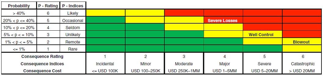
Below figure is a real example for Oil and Gas Industry (6 x 6 matrix):
Copyright: RMs modified from Pritchard et al. (2010).
Popularity of Heat Maps
Risk matrices are popular because they achieve many goals:
- RMs (Heat Maps) are easy to understand. They represent aesthetic view of risks and their categorizations.
- They are a quick reporting and communication tool to management and company’s executives.
- An indicator of risk appetite and risk tolerance of the company.
- Promoted by many international standards as good/best practices.
Is popularity of Heat Map masking its flaws?
The first section of this article has briefly presented the well-known model of the risk matrix (heat map). In this section, we list the challenges and flaws of risk matrices.
Although the RMs are widely used by practitioners in different fields (construction, oil and gas, banking…), there are severe critics by thought risk leaders.
- Risks are a range, not a point: let us consider an example of an area that is affected by storms and tornados. Some storms are occasionally, and very rarely, there will be a catastrophic storm. The risk is therefore needs to be listed by potential range of its outcomes. How could you plot the risk in a heat map? You need to color many squares in the graph, not a single square.
- The impact ranges are not mutually exclusive (they aren’t ratio scales). Example: Major impact (1-5 $MM) and severe impact ($5-20 MM) and catastrophic (>$20MM). There is no science beyond these ranges. It is made arbitrary.
- Human role: risk appetite. Categorizations of severity cannot be made objectively for uncertain consequences. Assessment of likelihood and consequence and resulting risk ratings require subjective interpretation, and different users may obtain opposite ratings of the same quantitative risks.
- Don’t include timeframe: a storm attack in next two weeks might be very different in storm attack in the next two months.
- Cannot accommodate the volatility of some risks. Some risks are static, while others could change on daily basis (better or worse).
I came across a research paper on risk matrices that mathematically proof the flaws of RMs. I encourage all professionals to read it and explore the topic further.
https://www.researchgate.net/publication/266666768_The_Risk_of_Using_Risk_Matrices1
The prominent examples in this paper:
- Risk prioritization could change if scaling is made ascending or descending
- Some risk outcomes in yellow zone could be more severe than the ones in red zone.
Alternatives to risk matrices?
Alexei Sidorenko, CRMP2 a thought leader in risk management proposes many alternatives.
- Decision trees or influence diagrams, bow-tie diagrams
- Scenario analysis
- Stress testing
- Simulation modelling technique
It is also very important to distinguish between 2 types of risk analysis techniques:
Techniques to better understand the nature of risk to make a decision how to manage it: bow-tie diagrams, FMEA/FMECA, HAZID, HAZMAT, HAZAN, 5 whys, influence diagrams, ICAM, etc.
Techniques to better understand how uncertainty affects the decision or objective: scoring, decision trees, sensitivity analysis, scenario analysis, stress testing, and various simulation techniques.
The application of the techniques above will also depend on the decision complexity, materiality, level of uncertainty and the time and resources available to risk manager.
Conclusion
D.W. Hubbard resembles the true value of RMs as little more than a “placebo effect”3.
As a summary, Risk matrices are a good communication tool because they are easy to understand, but the inherent flaws make them unreliable. Risk professionals needs to rely on risk and decision analytic procedures.
References
- The Risk of Using Risk Matrices. Philip Thomas, SPE, and Reidar B. Bratvold, SPE, University of Stavanger; and J. Eric Bickel, SPE, University of Texas at Austin.
- https://es.linkedin.com/in/alexsidorenko?trk=author_mini-profile_title
- Hubbard, D. W., The Failure of Risk Management, Hoboken, NJ: John Wiley & Sons, 2009.
Exclusive pmmagazine.net 💬